2018 was the year I finally met Royal Academy Summer Exhibition face to face. And as fate would have it, this was the 250th edition and they definitely went all out.
The Royal Academy Summer Exhibition has been an annual event since 1769 and today around 1,000 works are selected each year from 12,000 entries (this year it was over 1300 artworks on display). The exhibition offers an opportunity for the audience to see the whole map of present artistic endeavour by showing paintings, drawings, prints, photography, sculpture, video, performance art, installation and architectural designs and models from artists with a celebrity status and those who are just starting out in the art world. One of the traditional elements of the exhibition is that it is selected, curated and hung in a Salon-style display by artists, who are members of the Royal Academy (Wilding, 2006). Norman Ackroyd RA, Summer Exhibition co-ordinator in 2013 said: ‘It’s an exhibition selected by artists, hung by artists … we just choose the best art, and try to make sense of it on the walls. It was a truly democratic exhibition’ (Royal Academy, 2017). Additionally, the artworks are all for sale and 30% of the proceedings go towards the Royal Academy Schools in London to provide postgraduate art education, founded by Sir Joshua Reynolds. Moreover, monetary prizes of more than £55,000 are awarded to selected winners. In 2018, exuberant Grayson Perry was the master behind the coordination of the exhibition. I am still sad I unconveniently missed his show in Bristol last year, so I couldn’t really compare the two, though I expected it to be quite playful.


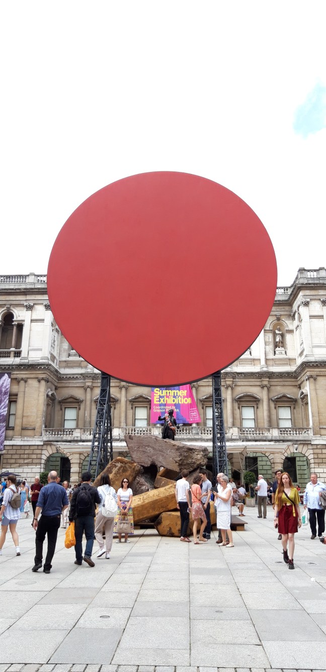
When I walked into the Royal Academy in London, I was surprised how crowded the building was (admittedly, it was a Summer Saturday). And per usual, me and my friend got a bit lost at the beginning. I was disappointed in the lack of signage, especially considering the building is huge and there were other exhibitions going on (also the fact RASE was for the first time extended across more gallery wings and floors as usual). But after the initial confusion, it all went smoothly.
The first thing that positively struck me after walking into the gallery was the brightness of the coloured walls which brought a whimsical character to the feel of the exhibition. It was stunning to see a proper Salon hang in that extent and even though I have been studying Salon-style displays for a long time, I immediately started facing a few dilemmas.
It was very hard to experience every single artwork, at first you noticed just the ones that really stood out. I started questioning if it is important to give all your attention on every single artwork hung, as we are used to in white cube displays? You could stand in one room for ages and discover new artworks and motifs every minute of looking. It felt like a visitor was supposed to go on an adventure to find treasure. The more you were staring, the more was revealed.


I felt that some artworks were really meant to be looked from up close, otherwise they lost their appeal and were not noticeable enough. Therefore, a curator really needed to know and understand what he/she was doing (or in some instances, the artworks might arrange themselves while in the space). In my honest opinion, I am not sure the curators here succeeded every time. Or it might have been something else. Some artworks were positioned on top of the vast walls where they were almost hidden; was that an intentional decision to hide them or did they just need to fill the empty space? On points, some very small sized artworks were squeezed completely on top, where they became almost invisible, insignificant. Fair, not fair? Intentional, inadvertent?
All throughout my visit, I was deliberating on the choices of the chosen artworks. Really hard to decide if the (personal) decisions of the selection panel were made properly (maybe because they are subjective?). The selection process must have been very different than at the Jerwood Drawing Prize, for example, where there are much less works selected and the visitor can make up his/her mind if the exhibited artworks are for his/her taste or not. I always wanted to know which artworks were left out of the final set up. Especially because one could submit more than one artwork. We can again start making exhibitions of rejected artists. Maybe we will wake up something in the art world community again. Just think about Impressionist movement..
Going back to the endless amount of exhibited artworks; there was no shown direction in which the visitor should enjoy the exhibition. Only the works, which have been numbered, were indicating the way. But was it even important to follow the numbers? Maybe only because of the amount of people visiting, so they wouldn’t bump into eachother, therefore the flow is better if everyone goes in the same direction?
Speaking of numbered artworks, there were no captions. Understandably, I guess. We wouldn’t want the walls to be even more cramped. Anyhow, a visitor had to buy a little booklet where the names of the artists were laid out. £3.50 for names with the prices. I felt that was quite a lot of money (plus £18 for the ticket), even though the quality of the book was great. But I get it, they need to get the money somehow, considering they are a charity run by artists.
To stop being so gloomy, I was impressed to see well-renowned artists exhibiting together with younger ones that got through the selection. Despite most of the times not being able to tell which artwork is whose and if it is famous or not, I must admit I was really drawn to some that turned out to be from Tracey Emin, for example. They are called masters for a reason, one could say. Though, looking around the rooms, it was a bit too much and overwhelming. Therefore, a bar inside one of the rooms was a wonderful idea. Wine indeed helped calm down my brain after being (positively) bombarded with the ocean of art.


One could indulge oneself in playing a where-does-your-eye-go game. And another fun game to play was guessing if the particular artworks have been positioned next to eachother as a commentary on purpose or it just happened (i.e. pure innocence vs. unnerving).


Each room was hung by a different artist, overseen by Perry. And though I could sense different themes, I was constantly asking myself who chose the artworks for the rooms. Need to really look into the process.. The feel of every room was distinctive, however, the variety of artworks and the history of this exhibition made it appear unified. The differences didn’t as much bother the flow, but rather brought in a unique dimension.
In all honesty, I admit I was not as amazed by the grey room. Was it beacuse the colour of the walls didn’t stand out as much as in the other rooms? Should that mean that the artworks were supposed to stand out more and make a bigger impact? Were the other rooms too pompy and the not-so-shiny-ones kept me waiting for more? Did they embitter me with the lack of energy? Oh my, have I sensed a feeling of bleakishness, like they couldn’t live up to my expectations? Well, all in all, that is definitely not fair to the artworks exhibited in those darker rooms; therefore, it would be good to think through the wall colours and maybe not start with the most stimulating one? And again, going back to the feel of too many works exhibited, the striking yellow room could be somewhere in the middle of the visit, for poor exhausted visitors to get some life back into them.


Unfortunatelly, the architectural room didn’t speak to me as well, but we all know I am a bit biased.. Some rooms just left me ‘meh’ and I quickly ran through them. Did I maybe begin my visit too enthusiastically and was already too tired to grasp the concepts of these rooms?


")


The white room was better, it felt more like a white cube exhibition. Was it because of the famous names of the invited artists? And yes, very hypocrite of me to say that that room felt the most like a proper exhibition (whatever that is). But it was mostly because of the ‘not-so-confusing’ hang and I could finally took a long, deep breath.


And then came the second floor.
First of all, visitors had to be very careful while walking around not to miss any of the works hidden in the corners, stairs and halls of the building. But would it even matter if you missed something? It probably would to the artists..
When I walked into the second floor, I almost had a heart attack. So many artworks I still needed to see and I was on my last legs. The first thing I noticed was the rooms here felt curated in a hackneyed manner. Colours together, themes together, nothing very original. Maybe they got bored, too..


But then, a smile on your face, when you notice some amazing pieces that really speak to you and you get some energy again. Or when a wave of joy travels through your body when you point out an artwork, the style of which looks quite similar to the one of the artist you exhibited in one of your own shows. And then check the booklet and realize that it is the same artist. Yes, Nick Greenglass, I am talking about you. Congratulations!


And after the second floor, when I thought it was finally over (it was definitely worth a visit, don’t get me wrong), there opened a ‘fun room’ in the adjacent building. These artworks were very welcomed and even though the topics were bitter and harsh, they made you feel relaxed and one could finally breathe again.


Going back to all the exhibited artworks, I was pleased to see very traditional stuff exhibited side by side very contemporary artworks. It means tradition is not dead yet and that is a big plus for our culture. However, I did notice a slight theme going through: loads of images of kitty cats and the Queen. That should mean something, shouldn’t it?
Let’s talk about the artworks that were sold. I was very surprised by the amount of sold artworks (red dots on display), but I am still not sure if I was expecting that or not. True, quite a lot of the works were semi-affordable and it would be interested to know where the buyers will hung the art. I am asking myself that, because some that were bought, were just questionable to have in your living room (and I mean that with all the love in the world). And let’s not forget about the lack of quality in some. But ok, that is definitely a very personal thing.. If it has gone through a selection process, some aspect of the artwork needs to be amazing. That is why I won’t even mention the artworks that won the prizes. They are very much debatable and I need to look more into the jury selection process again.


To conclude my visit (which I am definitely repeating next year), I sort of felt like I was in Louvre. You know, where there is just too much too see and you can’t really enjoy anything fully, because you are afraid you might miss something. Or is there a point in appreciating this vastness?
LIST OF REFERENCES:
Royal Academy (2017) About the Summer Exhibition. Available at: https://www.royalacademy.org.uk/summer-exhibition (Accessed: 21 August 2018).
Wilding, A. (ed.) (2006) Royal Academy Illustrated 2006: a selection from the 238th summer exhibition. London: Royal Academy of Arts.
LIST OF PHOTOGRAPHS:
- featured image: personal archive
- personal archive
- personal archive
- personal archive
- personal archive
- …

kako podrobna in pozorna predstavitav, bravo
LikeLike